Thanks to some connections at Microsoft I was made aware of some very interesting data that was published on the Windows Azure Data Marketplace by Practice Fusion – deidentified medical records of 5000 patients. Of course, I had to take a look. What I found was a very compelling and interesting set of data, that was more interesting when looked through the lens of Predixion Insight. Of course, as with any data that you may get from anywhere, there are first some issues in the data itself that need to be “corrected” before used for any analysis.
In this post I’ll show you how to get that data, explore a little bit of it, and clean up one particular part. There’s lots more to do, but this is just getting your feet wet.
In order to follow along at home, you will need Excel 2010, PowerPivot (get here), Predixion Insight for Excel (get here).
Step 1 – Loading the data
After you have all that software installed and running on your machine, you will want to go to the Practice Fusion Data page on Windows Azure and subscribe to their feed. If you haven’t subscribed to any the data market before, you will first have to agree to the MS terms of service to subscribe to the data market. After that you will have to agree to Practice Fusion’s terms of service and that will give you access to the data. Ignore the button there that allows you to load data directly into PowerPivot.The most efficient way to get all of the data is to go directly into PowerPivot, so launch Excel (or just create a new workbook since you probably already have Excel running anyway) and click on the PowerPivot button to get to the PowerPivot window.

PowerPivot Ribbon Section
Inside the PowerPivot window you will need to click the “From Azure Marketplace” button in the Get External Data chunk of the ribbon shown below. If you’re saying “Hey! I don’t have that button!” don’t be afraid. Microsoft quietly updated PowerPivot at least twice since it was released – go and download the latest release and try again – trust me – it will be there.The From Azure Marketplace Button launches the import wizard where you want to paste in the root URL for the data feed which is: https://api.datamarket.azure.com/Data.ashx/PracticeFusion/MedicalResearchData/
Also you will need to enter your account key, which, up to this point, you probably didn’t know you have. However clicking on the Find button will launch a web page displaying your unreadable key that you can copy and paste here.
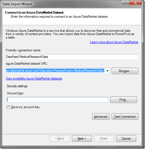
Table Import Wizard – Specifying the Data Feed
After that, select all the tables and click finish. Loading the data from the marketplace takes a little longer than you would expect – not “come back tomorrow” kind of long, but definitely the “I can’t be late for my daughter’s junior high school recital and if I take the laptop, I’ll lose my wireless connection” kind of long. So click finish and go to lunch, or get a coffee, or catch up on reading the Predixion Insight documentation or something.
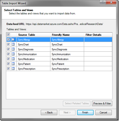
Table Import Wizard – Selecting all the Practice Fusion Tables
Step 2 – Initial Data Exploration
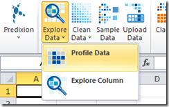
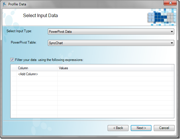
One of the somewhat interesting things about loading data from an unknown source is that you have absolutely no idea what you’re looking at. This is where you can leverage the awesomeness of Predixion Insight’s Profile Data tool. This tool provides a quick summary of the data in an Excel worksheet or PowerPivot table so you can at a very minimum determine if the data makes any sense at all.To run Profile Data, switch back to the Excel interface, click on the Insight Analytics ribbon and choose Profile Data under the Explore Data menu button. In the Profile Data Wizard, you just need to select that you are choosing PowerPivot and the source of the data and which table you want – in this case, let’s use the SyncChart table which documents the basic patient measurements over a series of doctor’s visits.
Next you choose the type of statistics – I really like using “advanced” statistics because it makes me feel smarter ;), but for initial exploration the default “basic” stats will suffice, so stick with the default and just click “Finish”
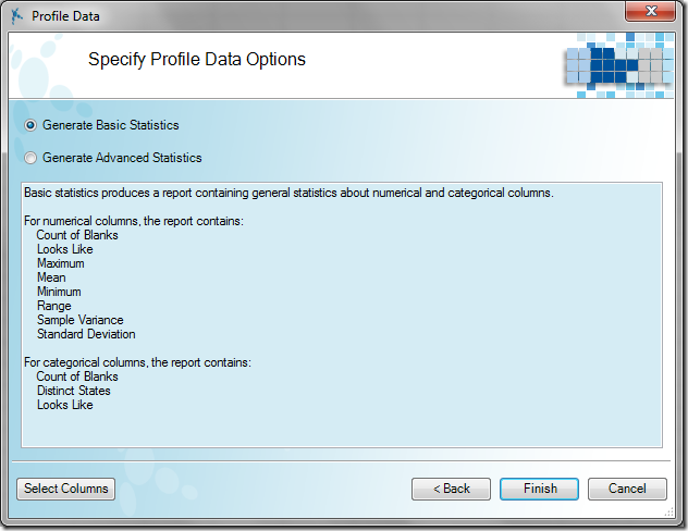
Profile Data Options
As a result, Predixion Insight will scan the table and produce a report on all of the columns in the PowerPivot table, as well as a handy index sheet to easily find the report in your workbook (which at this point should contain the report, the index, and three blank sheets, so it’s no biggie, but you know it will get more populated as you go on…). I can’t recommend strongly enough that, for your own sanity, you go ahead and run Profile Data on all of the tables in PowerPivot (see, that index will come in handy very quickly….)
In any case, let’s have a look at what Profile Data discovered.
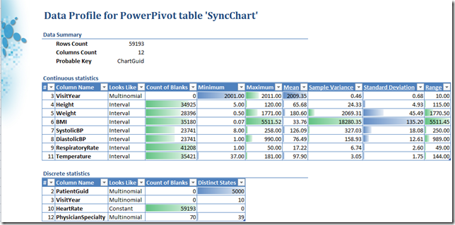
Results of Profile Data on the SyncChart table
First of all, Profile data did us a great service by simply telling us how many rows and columns are in the table – since we just randomly (well, not quite) pulled some data from the internet we had no idea what was in there, Profile Data let us know that we have 59,193 rows and 12 columns, and that the column ChartGuid is likely a key since it uniquely identifies each row (i.e, there are 59,193 unique values of ChartGuid).
Next the Profile Data report breaks the results down into a Continuous section and a Discrete section. The Continuous section contains information on columns that contain numerical data. The Discrete section contains information on columns that contain non-numerical data, or numerical data that “look like” they could be considered categorical, such as a column that contains just 0’s and 1’s.
One thing that stands out fairly immediately is that there is a lot of missing data in this table. All the continuous columns, save VisitYear, have over 23,000 blanks, and the HeartRate column is completely empty – i.e. it has 59,193 blanks in 59,193 rows.
Feel free to examine the resulting report for interesting pieces of information but for expediency’s sake, I want to point out some data that just looks wrong. Take a look at the ranges of values for Height, Weight, and BMI
Focus on Height, Weight, BMI
Now, not having any background in the data, we don’t know what units height and weight are measured in, but regardless of the units, the ranges are simply too extreme – given inches, feet, or centimeters, you simply don’t have the range of heights from 5 to 120 in human existence! Similarly with weight! BMI is unitless, but still with the range from 0.07 to 5511 you have quite the unnatural Jack Sprat situation going on here.
Looking at the results for the height column a little further indicates that there is a mean of 65 and standard deviation of about 5. This would indicate (to me, at least) that the intended units are inches, since the average height of humans is around 65 inches and not 65 centimeters or 65 feet or miles or whatever. So I’ll go ahead and decide that it’s inches. It would make sense that the weight would be in pounds since the height measurement is not using the metric system either, but looking at the average weight of 180 indicates that the value, while still high (this is America, anyway) isn’t likely to be kilograms or stone or other values.
Still, we need to figure out what is going on with those other values, so let’s move on to Step 3.
Step 3 – Cleaning up the data
Cleaning up data like this is never automatic – you need to use tools and apply your judgment. Just like we were able to use the Profile Data tool to help us understand the nature and deduce the units of the data, we need to apply the same common sense treatment to cleaning the data.The first question to ask is what do you really want to do with the erroneous data? Since these are medical records recording actual values of patients, the safest thing to do may be simply to null out the data for values that are out of range. However, since there are several rows for each patient, and people (once fully grown) generally don’t change in height too much, it may be OK to simply take a height measurement from another chart reading for the same patient. It really depends on how you’re going to use the data, so I’ll perform both methods.
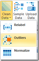
Let’s take the “whack the bad data” approach first. To do this, I’m going to use the Outliers tool from Predixion Insight which is under the Clean Data menu button on the Insight Analytics ribbon.
Clean Data/Outliers
Selecting this tool brings up the Remove Outliers ribbon which allows you to truncate the extreme ranges of numerical values or remove categorical values that occur infrequently (or even too frequently) from your data. First you need to select that you are interested in the PowerPivot table called SyncChart (as above) and then you select the column from which you want to remove the outliers. You can select via the drop down or by clicking on the column preview.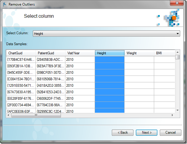
Outliers Column Selection
Next this brings up a chart of the values in the Height column. The higher the curve the more values are in that range. Personally, I like to increase the resolution of the chart to the maximum (100) so I can get the best view of the data – this sometimes doesn’t work well if there are a small number of data points, but this data set is sufficient. As you can see most of the data lies in the middle of the range with extreme values tapering off quickly. You can mouse over any point on the cart to see the range that point represents and how many rows have values in that range.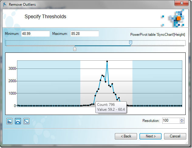
Remove Outliers Chart
To remove the outliers you simply drag the thumbs on the slider above the chart to whatever cutoff point you wish, or type in the limits into the text boxes directly. When you click next you get to the “what do I do with this?” screen. Again, the answer really depends on your application. For some problem spaces, it may be OK to set the extreme values to the limits or to the mean. In this case, we’re simply going to null out the value – the default option – and click next.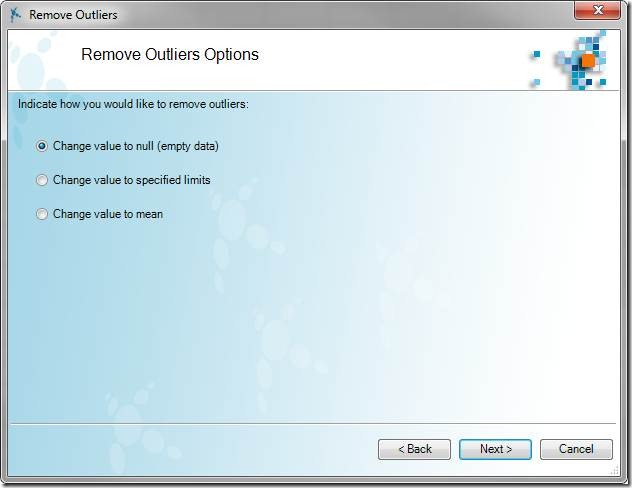
What do we do with a drunken data entry operator?
Which leads us to the final screen - name the result column – it’s good to pick a descriptive name. Finishing the wizard creates a calculated column in PowerPivot that nulls out any data that’s out of range. This has an added benefit in that if you refresh the table with new data, any new out of range data will automatically be set to null.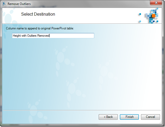
Finishing the Remove Outlier Wizard
Inspecting PowerPivot, we see that Predixion Insight injected the following DAX expression:=IF(AND('SyncChart'[Height]>= 48.99, 'SyncChart'[Height]
<85.28),'SyncChart'[Height],BLANK())
This expression simply copies the in-range values and replaces the out of range values with blanks.
Before looking at the results, I want to try the other method of removing outliers I proposed – using the average of a patient’s other visits. To do this I used the following custom DAX expression:
CALCULATE(AVERAGEX(SyncChart, SyncChart[Height]),
ALLEXCEPT(SyncChart, SyncChart[PatientGuid]),
SyncChart[Height]>48.99,
SyncChart[Height]<85.28)
This expression basically says, calculate the average of the Height column by first removing all filters except for a filter on the current rows PatientGuid Column, and also exclude any rows where the Height is out of range. I copied the IF expression created by Predixion Insight and replaced the part that says “BLANK()” with this custom expression. I renamed the new column “Height with Outliers Replaced”
The next thing I want to do before looking further is calculating the BMI. The BMI was included with the data, but is really a derived column. The formula for BMI using inches and pounds is BMI=Weight * 703/Height^2. In order to protect against divide by zero errors, I put an IF in the DAX expression to check for blanks and created two columns like this:
=IF(ISBLANK(SyncChart[Height with Outliers Removed]),
BLANK(),
SyncChart[Weight]*703/POWER(SyncChart[Height with Outliers Removed],2))
(Obviously one had the Outliers Replaced version of the column).
To see the impact of the results, I re-ran Profile Data against the SyncChart table with the new columns. Here are the results:

The first thing I noticed is that the Height with Outliers Replaced column has no blanks – this means two things – one, that every patient has at least one doctor’s visit where they have a height measurement, and two, I should have checked for ISBLANK in my expression to calculate that Height value!
The other things to notice is that the fixed height values are much more in line with reality - we’ve eliminated the pixies and the hill giants (frost giants are much taller). Also, the recomputed BMI values are starting to be more realistic as well. In fact we reduced the maximum BMI from over 5500 to 250 by only removing 317 values from 59193 rows – about 1/2%!
To complete the exercise and ensure that the BMI values were reasonable we would have to clean the Weight column as well, which we do by running through the Remove Outliers wizard again. However, there’s actually one more trick. When looking at the outliers for the Weight column, we get a chart that looks like this:
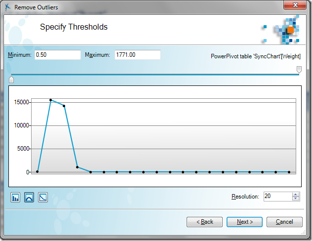
This occurs when you have a range of outliers that includes extremely large outliers that obscures the resolution of the data. To get a better view of the data, you can click the logarithm button – circled below – and get a much more usable visual – I also increased the resolution:
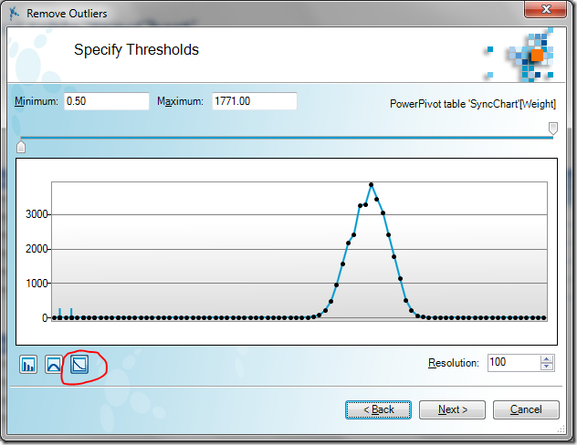
I removed the extreme outliers (rather arbitrarily choosing a range of about 33 – 510 lbs, which is still probably pretty extreme) replacing them with nulls. I didn’t try to do the “replace with other visits” trick, since people’s weight can fluctuate quote a bit from visit to visit.
Creating a new BMI column and re-running the Profile Data gave me results like this (other rows hidden):

You can see the range of BMI values went from an original 5511 to a more reasonable 78. It’s very likely (pretty much guaranteed) that I could have more tightly truncated both the height and weight variables to make them more inline with reality, but this is a good start.
Some deeper inspection of the data may be necessary to find the correct boundaries, and of course it always depends on how you are going to use the data. For predictive purposes, it generally is better to eliminate extreme values even if they are valid since they can skew the results. For traditional BI reporting – e.g. “how many visits were by people over 9 feet tall” – you generally want to keep any valid value, no matter how extreme. In either case, however, you do want to eliminate invalid values. Luckily with this data set, by combining common sense with the tools at hand we’re able to carve away at the bad data to make the remaining data useful for analysis.
That just may happen in a future post… ;)
