This post follows from my previous post on Cleaning Azure Marketplace Data. I recommend skimming that post prior to reading this one and possibly following through the steps. However, I did meet Matt Douglass of Practice Fusion at the Strata conference in Santa Clara, CA this week, and he graciously gave me permission to post my workbooks containing the practice fusion data as I progress so you can shortcut the steps and jump in at any time in this series.


Looking more into the Practice Fusion data, I took some more interest in considering the Height column that I cleaned up there. It got me thinking about what I could learn more about “Height” of these patients.
First, here’s what you need to follow along with this post:
Part 1 – What is height?
I want to see trends on height over time, so I:
- Create a Pivot Table from the PowerPivot ribbon
- Add my “Height with Outliers Removed” column from the SyncChart table (that I created last post) to the Values well
- Set the “Summarize By” property on the value to “Average”
- Add the “YearOfBirth” column from the SyncPatients table to the Axis Fields well
At this point PowerPivot prompts me that a relationship may be needed, so I allow PowerPivot to create the relationship, which it does correctly, and with some formatting I have a nice chart that looks like this:

Wow – how simple was that! We took the cleansed data and easily created a chart allowing PowerPivot to automatically create relationships among multiple tables that were downloaded from a public cloud source. Pretty cool – except that it’s wrong.
Well, “wrong” may be a bit harsh - “misleading” may be a better term. You see, we didn’t create a chart showing the Heights of Patients by the year they were born, we created a chart showing the height measurements taken by doctors averaged by the birth year of the patient. I’m not exactly sure why that would be useful. The impact of that is, for example, if there were two patients born in 1920, and one was 60 inches tall and the other was 70 inches, but the shorter patient went to the doctor 4 times and the taller only once, we would see the average for 1920 to be 62 inches ( (60*4 + 70*1)/5 ) rather than what we might expect at 65 inches ( (60 + 70)/2 ).
Understanding Height
So what we need do to is to define what “Height” means for a Patient rather than a Visit (each row in the SyncChart table represents a doctor’s visit). This type of attribute creation is very common when performing analyses – particularly for predictive analytics. To create a “Height” attribute we have to decide what “Hieght” means in terms of our data – this generally requires business understanding of the data, making assumptions of the data, or both. With the PracticeFusion data cleaned from the previous we have 0 or more measurements of height for each patient with extreme values removed. In this case, I’m going to use the average of all the height measurements. Realize that this assumes that any particular individual’s height didn’t change significantly – which is generally true if the patients are adults.
Given that the patients being adults is a hypothesis rather than a known fact, means that I should verify through experimentation. I went to the PowerPivot window and added a calculated column to the SyncChart table with this expression:
=SyncChart[VisitYear]-RELATED(SyncPatient[YearOfBirth])
I named that column “Age at Visit Time” and created the table below showing that out of almost 60,000 visits, only a handful had a potential to have an unexpected growth spurt. (Note that this was only possible because of the relationship between SyncChart and SyncPatient that was created at the beginning of this blog post.) To me, this validates that using the average height measurement across visits is a reasonable value for an individual patient’s height.
| Age | Count of ChartGuid |
| 14 | 2 |
| 16 | 9 |
| 17 | 140 |
| 18 | 331 |
| 19 | 482 |
| 20 | 479 |
| 21 | 459 |
| … | … |
Defining Height
Now that I’m convinced I know what “Height” is, I added another calculated column in the PowerPivot window to the SyncPatient table with the expression:
=AVERAGEX(RELATEDTABLE(SyncChart),
SyncChart[Height with Outliers Removed])
and named it simply “Height”. Creating a PivotTable and measuring the difference shows that in just the first few rows you have a difference of almost 3 inches – clearly showing the problems with the initial “naive” approach.
| YearOfBirth | Patient Height | Chart Height | Diff |
| 1920 | 62.0 | 61.1 | 0.87 |
| 1921 | 62.9 | 60.2 | 2.77 |
| 1922 | 64.1 | 64.1 | 0.02 |
| 1923 | 63.7 | 63.7 | 0.06 |
| 1924 | 63.8 | 64.9 | 1.16 |
| … | … | … | … |
FYI – due to the way PivotTables in Excel work, in order to make the “Diff” column I had to create a separate column outside of the PivotTable. Also, I couldn’t simply click in the cells like “=” click “-“ click and drag down since Excel generates a call to GETPIVOTDATA that has embedded strings that don’t change when you drag down. So I typed direct cell references (e.g. =ABS(C28-D28) ) and dragged the expression down along the PivotTable.
Part 2 – Pedantic Disclaimer
Now as a side note, I do want to apologize for maybe being overly pedantic about this process. I am trying to make sure I don’t have any of those moments where it’s very clear how you get from A to B and from C to D, but the path from B to C is a complete mystery, so I’m being liberal with throwing in all the side streets that come to mind, so pardon the stream of consciousness approach.
Part 3 – Back To the Topic – How tall am I anyway?
So now that I have determined the meaning and semantic of “Height” – I can inspect its value for each patient – so exciting!
| PatientGuid | Height |
| {0003CBB3-40EF-493F-9906-B8EF9F7E7B11} | 63.3 |
| {000D7634-7A8C-4CAD-895F-C241F19669DA} | 60.0 |
| {0016F7D0-EABF-4D55-BEA7-B08F7F8567FD} | 70.7 |
| {002FC25B-A761-4039-8507-E6FE59B19833} | 66.0 |
| … | … |
However, the problem with this “Height” metric is that although I have a measure, I still don’t really understand how “tall” they are. This is because our idea of “tallness” is purely based on how their height relates to other people’s heights. To use some five-syllable words, the values shows how tall they are quantitatively, but not qualitatively. In order to understand an individual’s “tallness” we need another metric.
The way we create this metric is to use Predixion Insight’s data preparation tools to normalize the Height data. Normalization is a process in which numeric data is transformed so that values can be more easily compared. Predixion Insight supports three types of normalization – Z-Score, Min-Max, and Log. While Min-Max and Log normalization are fascinating topics in their own right, in this case we will be using Z-Score normalization.
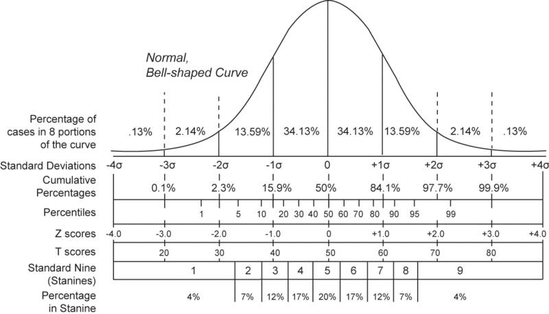
In short, Z-Score normalization transforms a value by first subtracting the average of all values and then dividing the result by the standard deviation of the values. Assuming a normal bell-curve style distribution, the resulting value has some interesting properties.
The chart below from wikipedia shows that if, after normalization, a value has a Z-Score of 0, the value is perfectly average, whereas if the value is 1, it is larger than 84.1% of all values. Therefore, if a person has a Height that has a Z-Score of 1, we can confidently say that person is “tall”, and if the Z-Score of their Height is –1, they most definitely are “short.”
So walking through the normalization wizard in Predixion Insight is straightforward. First you click on the Clean Data menu button in the Prepare Data chunk of the Insight Analytics ribbon.

Next you read the very helpful and instructive text on the introductory page and advance to the data selection page where you choose that you want PowerPivot data and the SyncPatient table.

Then you choose which columns to normalize. Good thing to remember for future use is that you can normalize all the numeric columns in a table at once, which is a great time saver. In this case, there’s only a single column that is useful to normalize, so I ensure that only the Height column in selected.

Finally, we choose “Normalization Options” which is the normalization type and some grouping options. Grouping Options we will get back to, but you can select the different types of normalization to read the fun and informative descriptive text. Alternatively, you can leave the defaults as they are and just click “Finish”.

The effect of the wizard is to add a new “Height Normalized” column to your workbook with the following expression:
=IF(ISBLANK('SyncPatient'[Height]), BLANK(),
IFERROR(('SyncPatient'[Height]-
AVERAGE('SyncPatient'[Height]))/SQRT(
SUMX('SyncPatient', IF(
ISBLANK('SyncPatient'[Height]),0,
('SyncPatient'[Height]-
AVERAGE('SyncPatient'[Height]))^2))
/(COUNT('SyncPatient'[Height])-1)), 0))
You might want to copy and paste that somewhere for safe-keeping so you can do a search and replace whenever you want to use it in PowerPivot, or you can just use Predixion Insight and let the wizard do it for you.
Taking the table from above of patients and heights and adding the new “Height Normalized” column, you now have some qualitative information
| PatientGuid | Height | Height Normalized |
| {0003CBB3-40EF-493F-9906-B8EF9F7E7B11} | 63.3 | -0.7 |
| {000D7634-7A8C-4CAD-895F-C241F19669DA} | 60.0 | -1.5 |
| {0016F7D0-EABF-4D55-BEA7-B08F7F8567FD} | 70.7 | 1.1 |
| {002FC25B-A761-4039-8507-E6FE59B19833} | 66.0 | 0.0 |
| {0032D035-1A8C-40FC-B4A7-6A5B8DA93D06} | 70.0 | 1.0 |
| {00453E13-85AD-45B9-9D93-C5BCF0ABEA54} | 56.6 | -2.3 |
| {005B6A30-C5CE-4588-B77B-2550174D6CE1} | 66.0 | 0.0 |
| … | … | … |
You can now tell that the first two patients are “short” and the third is quite “tall”. However, and you knew this was coming, and not just because of my effective foreshadowing above, the data can still play tricks on you.
If I go and add an additional feature to the report – Gender – we see that there is more interpretation of the data to be done. Basically we see that the normalized values are telling us that women are “short” (they have mostly negative Z-Scores) and men are “tall” (they have mostly positive Z-Scores). Since our “business knowledge” of the world around us tells us “duh” we need to do a little more work. Wouldn’t it be nice if we could normalize women separately from men?
| PatientGuid | Gender | Height | Height Normalized |
| {0003CBB3-40EF-493F-9906-B8EF9F7E7B11} | F | 63.3 | -0.7 |
| {000D7634-7A8C-4CAD-895F-C241F19669DA} | F | 60.0 | -1.5 |
| {0016F7D0-EABF-4D55-BEA7-B08F7F8567FD} | M | 70.7 | 1.1 |
| {002FC25B-A761-4039-8507-E6FE59B19833} | M | 66.0 | 0.0 |
| {0032D035-1A8C-40FC-B4A7-6A5B8DA93D06} | M | 70.0 | 1.0 |
| {00453E13-85AD-45B9-9D93-C5BCF0ABEA54} | F | 56.6 | -2.3 |
| {005B6A30-C5CE-4588-B77B-2550174D6CE1} | M | 66.0 | 0.0 |
Well as we have it, we can. Run through the Normalization Wizard just as above but stop on the Normalization Options page. This time choose the Grouping Option “Group By” and select “Gender.” This does just what we want. Women’s heights will be normalized among women, and men’s against men.

Again, Predixion Insight updates the PowerPivot table by adding a calculated column – this time entitled “Height Normalized By Gender”. I’m not going to put the expression here – it’s basically the same as the one above but with several CALCULATE and ALLEXCEPT expressions thrown in for good measure – besides, the curious can see the expression by downloading the resulting workbook and taking a look for yourself.
This time the results look a little different
| PatientGuid | Gender | Height | Height Normalized | Height NormalizedByGender |
| {0003CBB3-… | F | 63.3 | -0.7 | -0.1 |
| {000D7634-… | F | 60.0 | -1.5 | -1.3 |
| {0016F7D0-… | M | 70.7 | 1.1 | 0.5 |
| {002FC25B- … | M | 66.0 | 0.0 | -1.0 |
| {0032D035-… | M | 70.0 | 1.0 | 0.3 |
| {00453E13-… | F | 56.6 | -2.3 | -2.5 |
| {005B6A30-… | M | 66.0 | 0.0 | -1.0 |
| … | … | … | … | … |
This time we see that that first woman isn’t really all that short – just a hair under average, and the first man isn’t quite as tall as we thought. With this information we now have an accurate understanding of the “tallness” of each individual that makes sense in terms of how we comprehend the real world.
Hey – to make it even nicer, we can add some quick conditional formatting to the normalized by gender column to get a quick heatmap of gender relative tallness – something you simply could not do without this technique.

Although this example is on a sample dataset, you can easily apply this technique to a variety of applications. For example, if you were looking at mean time to failure of a common mechanical part, you could normalize by the device in which it was installed. Or if you were interested in housing prices, you may normalize by zip code.
For your convenience, I put the end result of this experiment on SkyDrive as well.,
In case anyone is interested, my current “tallness” is between 0.1 and 0.2, so I guess I’m “tall-ish”, but not particularly so :).


