Wednesday, April 20, 2011

Profiling all PowerPivot tables at once using Predixion Insight VBA

In a previous post, I showed how to use Predixion Insight For Excel’s Data Profile feature to get descriptive statistics on PowerPivot tables – in that case using the great Practice Fusion data from the Windows Azure Data Marketplace.  In practice, however, this feature is so useful that I always find myself profiling every table every time I load up a dataset in PowerPivot, so it’s a bit cumbersome to go through the user interface (regardless of how attractive it really is) each time.
One thing that you may not be aware of is that Predixion Insight for Excel has a VBA API that allows you to not only interact with Predixion Insight objects, but with PowerPivot objects as well.  Using this API, I can easily create a simple VBA macro that executes a Data Profile for each attached PowerPivot table.
The first thing you need to do is to enable the developer ribbon in Excel since it’s hidden by default.  You can do this by going to File/Options and selecting “Customize the Ribbon” and checking the “Developer” option in the “Main Tabs” tree control.  Then switch to the developer ribbon and click the “Visual Basic” icon, which, in a throwback to turn of the century user interfaces, launches the VBA editor.
image
The VBA editor did not get the facelift the rest of Office 2007/10 did…
Once you’re in the VBA editor – you need to add a reference to the Predixion Insight VBA library.  Select Tools/References from the VBA editor and choose the Predixion Insight VBA API for Microsoft Excel.  (Hint – when the dialog appears, press “Q” and then scroll up – you will find it much quicker!)
image
To have a place to write some code, simply select the Insert menu and choose “Module”, which will create an editor that you can write code.  The code is very straightforward, you create your PowerPivot and Data Exploration objects from the Predixion VBA library, connect to PowerPivot to get the list of tables, and then get a data profile for each table that is returned.  You can copy the code below into the VBA editor as is.
Sub ProfileAllPowerPivotTables(AdvancedProfile As Boolean)
Dim PowerPivot As New PredixionVBA.PowerPivot
Dim DataExploration As New PredixionVBA.DataExploration

PowerPivot.ConnectToPowerPivot
TableList = PowerPivot.GetPowerPivotTables()
For Each Table In TableList
Application.StatusBar = "Profiling PowerPivot Table: " + _
Table
DataExploration.GenerateDataProfileForPowerPivot Table, "", _
AdvancedProfile, ""
Next
Application.StatusBar = ""
End Sub


Sub ProfileAllPowerPivotTablesAdvanced()
ProfileAllPowerPivotTables (True)
End Sub


Sub ProfileAllPowerPivotTablesBasic() 
ProfileAllPowerPivotTables (False) 
End Sub 


As I stated, the code is fairly straightforward.  The other parameters for GenerateDataProfileForPowerPivot are an optional table filter and an optional list of columns, which you probably don’t need to get a quick profile of all the tables in a first shot.  Running either of the top level functions on the Predixion Sample Data workbook by clicking on the green “play” button generates all the profiles in about a minute with an index to boot.


image

Monday, April 18, 2011

Transactional Sampling with PowerPivot and Predixion Insight

Predixion Insight For Excel provides some excellent sampling tools that can be applied to data in Excel worksheets or in an embedded PowerPivot database.  If you believe that there are any analysis opportunities outside of pivot tables, sampling PowerPivot becomes very interesting.  Since very few tools outside of Predixion Insight can read PowerPivot data directly and you simply cannot move over 1 million rows from PowerPivot into an Excel worksheet, you are pretty much stuck if you want to perform varied analyses on that PowerPivot data.  By sampling PowerPivot data you can leverage any techniques that you know and love in native Excel for analysis as well as using any other analytical addins such as the Microsoft Solver Foundation.
Predixion Insight offers three kinds of sampling – percentage, row count, and balanced.  Percentage sampling allows you to specify a specific percentage and will produce a random sample with approximately that percentage of data rows from the source table.  Row count will produce a sample containing exactly the number of rows you request (assuming there are that many in the source table to begin with).  Balanced sampling is a special case since the purpose isn’t to reduce data volume, rather it is to accentuate a typically rare feature of the data for better pattern discovery – e.g. increase the balance of rows representing fraudulent vs non fraudulent cases.  Independent of the sampling type, the resulting sampled set can be created as a table in an Excel worksheet or in PowerPivot (ProTip: in a pinch, using Predixion Insight sampling is a great trick to move data back and forth between the two).
However, when you have transactional data, you really need to think about sampling a little differently.  In transactional data, information about a single transaction is contained across multiple rows.  Sampling individual rows would actually break up a transaction and change the nature of the data itself.  For example, a 20% sample of shopping cart data essential removes 8 items out of a 10 item basket – you would be very unlikely to find the mythical beer and diapers correlation that way!  Instead you need a way to sample that would take an entire transaction rather than individual rows.
In order to accomplish this, you need Excel and PowerPivot (obviously) as well as Predixion Insight for Excel and the source database from which you pull your transactional data. 
I’ll go through the entire sequence explicitly, but here are the high level steps:
  • Load transactional data into PowerPivot
  • Load distinct transactional id’s into PowerPivot
  • Create a sample of the transactional keys
  • Add a relationship to PowerPivot between the full data table and the sample
  • Add a calculated column indicating rows that are selected
  • Use that column as a table filter
In this example, I’m using some data from Last.FM regarding music artists and user submitted tags that I pulled from here.
image
You can see that the data is “transactional” with the “Artist ID” being the transaction ID with the “Tag” being the items in the transactions.
First get the data into PowerPivot by opening the PowerPivot window from Excel and selecting “From Database/From SQL Server” from the ribbon.  (If your data is in a different database, find it under “from other sources”)
image
This launches the table import wizard where you indicate the location and database containing the data to load, and then select the transactional table.
image
Next go back to the Table Import Wizard, but this time, select the “Write a query” option
image
The query is a simple “SELECT DISTINCT” of the transaction ID’s.  Note that the “Friendly Query Name” will end up as the table name in PowerPivot so it’s a good idea to set it here.
image
Then you go back to Excel, switch to the Insight Analytics ribbon and choose the “Sample Data” tool
image
Select “PowerPivot Data” as the input type and choose the result of the select distinct query as the table.
image
Choose the sampling method – in this case you will want to choose Random Sampling to reduce data volumes.
image
Then choose how many transactions you want in the output.  This is entirely up to you at this point.  For this example, I chose 10,000 transactions, but really it’s whatever you choose to be right for your scenario.
image
Finally, specify where you want the results – you need to add the results as a PowerPivot table, but you can change the name.  There’s no point in creating an unselected list as you will see later in the example.
image
When the sampling is complete you can open PowerPivot, switch to the sampled data page and see how many transactions you selected.  Since I chose 10,000 for this example, there are exactly 10,000 transaction ID’s in the result!
image
Now you need to create a relationship between the Selected Data table and the source table – in my example, that’s the LastFM table.  First, in the PowerPivot window, switch to the Design ribbon and click “Create Relationship.”
image
In the Create Relationship dialog, relate the transaction ID from the Selected Data table to the transaction ID of the full transaction table.
image
Next you need to add a calculated column to the full transaction table indicating for each row if that row has been selected or not.  There are many DAX expressions that will work to do this, I chose the straightforward “not blank related” approach. 
image
And that’s it!  You now have a sampled a transactional table – or at least labeled rows in a transactional table in such a way that you can easily select the sampled transactions.  In Predixion Insight for Excel, you can always filter a PowerPivot data source for any operation using the filter control on the data selection page.  Also, this is why you don’t need to keep the “unselected” samples since you can easily choose either the “selected” items or the “unselected” items in any filter.
image
Let me finish this off with one more ProTip.  It’s unlikely that you will want these extra tables – i.e. the distinct list and sampled list of transaction ids – to show up in your pivot table analyses.  While you can’t explicitly hide tables in PowerPivot, if you hide all the columns in a PowerPivot table it has the same effect.  So to effectively hide a table from pivot charts, go to the Design ribbon in PowerPivot and use the Hide and Unhide tool to hide all of the columns in the extra tables.

Thursday, March 3, 2011

Predixion Software on BITV

image_thumb36
Bruno Aziza’s Business Intelligence TV spot on Predixion Software just aired on his blog, and despite the video thumbnail of me looking like I just sucked on a lemon, it came out pretty well.  During the video I discuss the application I built using the Practice Fusion Data from the Azure Marketplace.

The video below demonstrates the application and shows how I create the application starting with an almost empty workbook (there’s some graphics in there and a wee bit of VBA code). 

In case you didn’t know already, we have more videos on Predixion Insight at our YouTube channel that provide more information about Predixion and tutorials on how to use the product.
I’ll continue this series with some more discussion of the dataset as well as how to create the model and VBA code used in the video.

Wednesday, February 16, 2011

Prescription Finder Demo

This really isn’t a blog post – it’s just a post so you can find the related materials for the Prescription Finder demo that will appear in video links any time now.
Without a lot of additional explanations, just in case you’ve stumbled upon this accidentally, this is what the demo looks like.
image
You can access the demo files from the SkyDrive folder below.  To run the entire demo, you will need to import the included model into your Predixion Insight account (get a free trial if you don’t have one!)

Enjoy!

Tuesday, February 8, 2011

Data Preparation Webinar Slide Deck

Here’s the deck that I presented at today’s webinar complete with the DAX formulas I added to the PracticeFusion PowerPivot workbook.  You can get the data from the Azure Marketplace or download one of my preloaded copies.
Included in the deck is the coupon code for 50% off the Predixion Insight Cloud service for 3 months – expires 3/15/2011!

Drop me a line or post a comment if you have any questions!  (I’ll update this post when the video is posted)
EDIT:  Webinar replay is available here

Sunday, February 6, 2011

The Full Data Profile - Azure Marketplace Data with PowerPivot and Predixion Insight Part 3

image
In the first post of the series I gave a screenshot of a basic Profile Data report from Predixion Insight, leaving creating the remaining reports as “an exercise for the reader.”  Of course, if you don’t currently have Excel 2010 installed on your system, you may worried that you wouldn’t be able to complete the assignment and might get a bad grade on the pop quiz that’s coming up after the next few posts.  (Just kidding).
Since I got permission to go ahead and post the data and results for my last post, I put the work-in-progress files up on SkyDrive.  To make it easier to see what Profile Data in Predixion Insight really does I embedded the results here for you to explore interactively.    If you want to feel like Gulliver in Lilliput poking through the castle windows you can click around in this interface, otherwise you can click on the “View full size workbook”image button for better access.

This workbook was created by downloading the Practice Fusion data as described here and running the Profile Data tool from Predixion Insight on each table in PowerPivot.  I ran Profile Data twice on each table so you can see the difference imagebetween the “Basic” and “Advanced” profile reports.  Then I just edited the names on  the worksheet tabs and the report titles.  The Insight Index is automatically created and updated to create a nice guide to the workbook – it also updates automatically as you change worksheet names and report titles, so it’s convenient as well.  If you delete rows in your index, or delete the whole page, or somehow do something irreversible to the worksheet (it is in an Excel worksheet, after all), you can regenerate the Insight Index from the Options dialog available under the Predixion menu button.
One more thing I had to do to host the workbook interactively in SkyDrive is to drop all the PowerPivot tables after creating the reports.  The Excel file was between 9 and 10 MB which is too large for viewing in the browser.

Advanced Data Profile

I explained a bit about the basic data profile at the start of this series, so I’ll just explain briefly the difference.  Essentially the difference is that you just get more stats with “Advanced” than you do with “Basic”, plus the report takes slightly longer to execute as it has more to compute.
For numerical columns, Advanced adds measures such as Kurtosis and Skewness which measure the “normality” of the data – that is – how well the data conforms to a bell curve, an approximate median, the mode, and the confidence interval.  For those who aren’t familiar with these terms, they are defined with links to appropriate Wikipedia articles in the column headers.
The Advanced Profile Data report also contains correlation and covariance matrices for numerical columns.  Looking at the correlation matrix for the SyncChart table, for example, shows a clear correlation between Weight and BMI, and a negative correlation between Height and BMI.
image
For categorical columns, the Advanced report adds the top and bottom 3 states present in the column, as well as a number representing the top 80% of the states in the data.  This number tells you how many values of the column cover 80% of the data.  Using the SyncChart example again, you can see that although there are 39 different physician specialties represented in the data, 80% of the visits are to only 3 types of physicians.
imageimage
A good use of the top and bottom states is to let you know if the data is particularly useful.  For instance the PhysicianSpecialty row above shows that the bottom three states appear only once in the data.  This indicates that, for Predictive Analytics at least, you will not find any patterns regarding Naturopathy-Acupuncture, Dermatology, or Physical Medicine & Rehabilitation using this data.  A good practice to deal with data that shows up with way is to use the Clean Data/Outliers tool to rename such states to “Other”.  (Personally, with this data, I would also use Clean Data/Relabel to change blank states in this columns to “Unknown”).

How do get this stuff

Just to recap for those who haven’t read the other posts, the you can get the tools used to create these reports from the following locations:

Friday, February 4, 2011

Azure Marketplace Data with PowerPivot and Predixion Insight Part 2 - How tall am I anyway?

This post follows from my previous post on Cleaning Azure Marketplace Data.  I recommend skimming that post prior to reading this one and possibly following through the steps.  However, I did meet Matt Douglass of Practice Fusion at the Strata conference in Santa Clara, CA this week, and he graciously gave me permission to post my workbooks containing the practice fusion data as I progress so you can shortcut the steps and jump in at any time in this series.

image

Looking more into the Practice Fusion data, I took some more interest in considering the Height column that I cleaned up there. It got me thinking about what I could learn more about “Height” of these patients. 

First, here’s what you need to follow along with this post:

Part 1 – What is height?

I want to see trends on height over time, so I:

  • Create a Pivot Table from the PowerPivot ribbon
  • Add my “Height with Outliers Removed” column from the SyncChart table (that I created last post) to the Values well
  • Set the “Summarize By” property on the value to “Average”
  • Add the “YearOfBirth” column from the SyncPatients table to the Axis Fields well

At this point PowerPivot prompts me that a relationship may be needed, so I allow PowerPivot to create the relationship, which it does correctly, and with some formatting I have a nice chart that looks like this:

image

Wow – how simple was that!  We took the cleansed data and easily created a chart allowing PowerPivot to automatically create relationships among multiple tables that were downloaded from a public cloud source.  Pretty cool – except that it’s wrong.

Well, “wrong” may be a bit harsh - “misleading” may be a better term.  You see, we didn’t create a chart showing the Heights of Patients by the year they were born, we created a chart showing the height measurements taken by doctors averaged by the birth year of the patient.  I’m not exactly sure why that would be useful.  The impact of that is, for example, if there were two patients born in 1920, and one was 60 inches tall and the other was 70 inches, but the shorter patient went to the doctor 4 times and the taller only once, we would see the average for 1920 to be 62 inches ( (60*4 + 70*1)/5 ) rather than what we might expect at 65 inches ( (60 + 70)/2 ).

Understanding Height

So what we need do to is to define what “Height” means for a Patient rather than a Visit (each row in the SyncChart table represents a doctor’s visit).  This type of attribute creation is very common when performing analyses – particularly for predictive analytics.    To create a “Height” attribute we have to decide what “Hieght” means in terms of our data – this generally requires business understanding of the data, making assumptions of the data, or both.  With the PracticeFusion data cleaned from the previous we have 0 or more measurements of height for each patient with extreme values removed.  In this case, I’m going to use the average of all the height measurements.  Realize that this assumes that any particular individual’s height didn’t change significantly – which is generally true if the patients are adults.

Given that the patients being adults is a hypothesis rather than a known fact, means that I should verify through experimentation.  I went to the PowerPivot window and added a calculated column to the SyncChart table with this expression:

=SyncChart[VisitYear]-RELATED(SyncPatient[YearOfBirth])

I named that column “Age at Visit Time” and created the table below showing that out of almost 60,000 visits, only a handful had a potential to have an unexpected growth spurt.  (Note that this was only possible because of the relationship between SyncChart and SyncPatient that was created at the beginning of this blog post.)  To me, this validates that using the average height measurement across visits is a reasonable value for an individual patient’s height.

Age Count of ChartGuid
14 2
16 9
17 140
18 331
19 482
20 479
21 459
… …


Defining Height

Now that I’m convinced I know what “Height” is, I added another calculated column in the PowerPivot window to the SyncPatient table with the expression:

=AVERAGEX(RELATEDTABLE(SyncChart),
          SyncChart[Height with Outliers Removed])

and named it simply “Height”.  Creating a PivotTable and measuring the difference shows that in just the first few rows you have a difference of almost 3 inches – clearly showing the problems with the initial “naive” approach.

YearOfBirth Patient Height Chart Height Diff
1920 62.0 61.1 0.87
1921 62.9 60.2 2.77
1922 64.1 64.1 0.02
1923 63.7 63.7 0.06
1924 63.8 64.9 1.16
… … … …

FYI – due to the way PivotTables in Excel work, in order to make the “Diff” column I had to create a separate column outside of the PivotTable.  Also, I couldn’t simply click in the cells like “=” click “-“ click and drag down since Excel generates a call to GETPIVOTDATA that has embedded strings that don’t change when you drag down.  So I typed direct cell references (e.g. =ABS(C28-D28) ) and dragged the expression down along the PivotTable.

Part 2 – Pedantic Disclaimer

Now as a side note, I do want to apologize for maybe being overly pedantic about this process.  I am trying to make sure I don’t have any of those moments where it’s very clear how you get from A to B and from C to D, but the path from B to C is a complete mystery, so I’m being liberal with throwing in all the side streets that come to mind, so pardon the stream of consciousness approach.

Part 3 – Back To the Topic – How tall am I anyway?

So now that I have determined the meaning and semantic of “Height” – I can inspect its value for each patient – so exciting!

PatientGuid Height
{0003CBB3-40EF-493F-9906-B8EF9F7E7B11} 63.3
{000D7634-7A8C-4CAD-895F-C241F19669DA} 60.0
{0016F7D0-EABF-4D55-BEA7-B08F7F8567FD} 70.7
{002FC25B-A761-4039-8507-E6FE59B19833} 66.0
… …

However, the problem with this “Height” metric is that although I have a measure, I still don’t really understand how “tall” they are.  This is because our idea of “tallness” is purely based on how their height relates to other people’s heights.  To use some five-syllable words, the values shows how tall they are quantitatively, but not qualitatively.  In order to understand an individual’s “tallness” we need another metric.

The way we create this metric is to use Predixion Insight’s data preparation tools to normalize the Height data.  Normalization is a process in which numeric data is transformed so that values can be more easily compared.  Predixion Insight supports three types of normalization – Z-Score, Min-Max, and Log.  While Min-Max and Log normalization are fascinating topics in their own right, in this case we will be using Z-Score normalization.

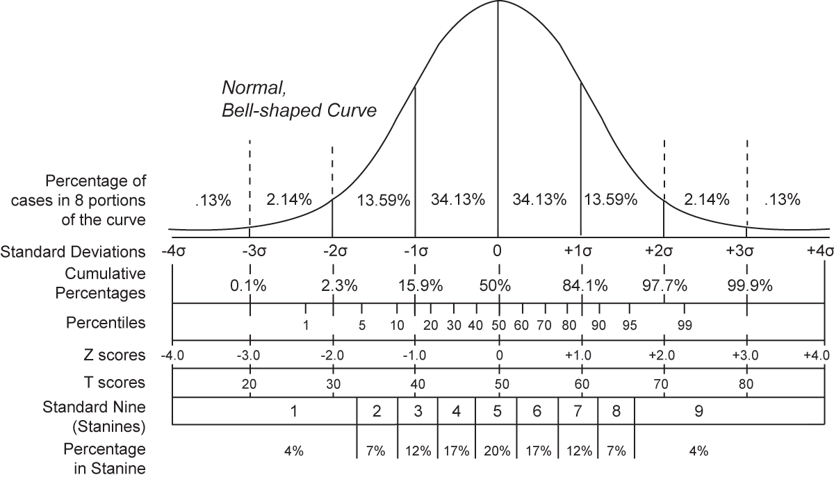
In short, Z-Score normalization transforms a value by first subtracting the average of all values and then dividing the result by the standard deviation of the values.  Assuming a normal bell-curve style distribution, the resulting value has some interesting properties.

The chart below from wikipedia shows that if, after normalization, a value has a Z-Score of 0, the value is perfectly average, whereas if the value is 1, it is larger than 84.1% of all values.  Therefore, if a person has a Height that has a Z-Score of 1, we can confidently say that person is “tall”, and if the Z-Score of their Height is –1, they most definitely are “short.”

File:Normal distribution and scales.gif

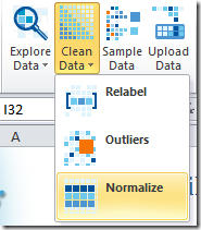
So walking through the normalization wizard in Predixion Insight is straightforward.  First you click on the Clean Data menu button in the Prepare Data chunk of the Insight Analytics ribbon.
image

Next you read the very helpful and instructive text on the introductory page and advance to the data selection page where you choose that you want PowerPivot data and the SyncPatient table.

image

Then you choose which columns to normalize.  Good thing to remember for future use is that you can normalize all  the numeric columns in a table at once, which is a great time saver.  In this case, there’s only a single column that is useful to normalize, so I ensure that only the Height column in selected.

image

Finally, we choose “Normalization Options” which is the normalization type and some grouping options.  Grouping Options we will get back to, but you can select the different types of normalization to read the fun and informative descriptive text.  Alternatively, you can leave the defaults as they are and just click “Finish”.

image

The effect of the wizard is to add a new “Height Normalized” column to your workbook with the following expression:

=IF(ISBLANK('SyncPatient'[Height]), BLANK(),
   IFERROR(('SyncPatient'[Height]-
    AVERAGE('SyncPatient'[Height]))/SQRT(
     SUMX('SyncPatient', IF(
        ISBLANK('SyncPatient'[Height]),0,
          ('SyncPatient'[Height]-
           AVERAGE('SyncPatient'[Height]))^2))
   /(COUNT('SyncPatient'[Height])-1)), 0))

You might want to copy and paste that somewhere for safe-keeping so you can do a search and replace whenever you want to use it in PowerPivot, or you can just use Predixion Insight and let the wizard do it for you.

Taking the table from above of patients and heights and adding the new “Height Normalized” column, you now have some qualitative information

PatientGuid Height Height Normalized
{0003CBB3-40EF-493F-9906-B8EF9F7E7B11} 63.3 -0.7
{000D7634-7A8C-4CAD-895F-C241F19669DA} 60.0 -1.5
{0016F7D0-EABF-4D55-BEA7-B08F7F8567FD} 70.7 1.1
{002FC25B-A761-4039-8507-E6FE59B19833} 66.0 0.0
{0032D035-1A8C-40FC-B4A7-6A5B8DA93D06} 70.0 1.0
{00453E13-85AD-45B9-9D93-C5BCF0ABEA54} 56.6 -2.3
{005B6A30-C5CE-4588-B77B-2550174D6CE1} 66.0 0.0
… … …

You can now tell that the first two patients are “short” and the third is quite “tall”.  However, and you knew this was coming, and not just because of my effective foreshadowing above, the data can still play tricks on you.

If I go and add an additional feature to the report – Gender – we see that there is more interpretation of the data to be done.  Basically we see that the normalized values are telling us that women are “short” (they have mostly negative Z-Scores) and men are “tall” (they have mostly positive Z-Scores).  Since our “business knowledge” of the world around us tells us “duh” we need to do a little more work.  Wouldn’t it be nice if we could normalize women separately from men?

PatientGuid Gender Height Height Normalized
{0003CBB3-40EF-493F-9906-B8EF9F7E7B11} F 63.3 -0.7
{000D7634-7A8C-4CAD-895F-C241F19669DA} F 60.0 -1.5
{0016F7D0-EABF-4D55-BEA7-B08F7F8567FD} M 70.7 1.1
{002FC25B-A761-4039-8507-E6FE59B19833} M 66.0 0.0
{0032D035-1A8C-40FC-B4A7-6A5B8DA93D06} M 70.0 1.0
{00453E13-85AD-45B9-9D93-C5BCF0ABEA54} F 56.6 -2.3
{005B6A30-C5CE-4588-B77B-2550174D6CE1} M 66.0 0.0

Well as we have it, we can.  Run through the Normalization Wizard just as above but stop on the Normalization Options page.  This time choose the Grouping Option “Group By” and select “Gender.”  This does just what we want.  Women’s heights will be normalized among women, and men’s against men.

image

Again, Predixion Insight updates the PowerPivot table by adding a calculated column – this time entitled “Height Normalized By Gender”.  I’m not going to put the expression here – it’s basically the same as the one above but with several CALCULATE and ALLEXCEPT expressions thrown in for good measure – besides, the curious can see the expression by downloading the resulting workbook and taking a look for yourself.

This time the results look a little different

PatientGuid Gender Height Height Normalized Height NormalizedByGender
{0003CBB3-… F 63.3 -0.7 -0.1
{000D7634-… F 60.0 -1.5 -1.3
{0016F7D0-… M 70.7 1.1 0.5
{002FC25B- … M 66.0 0.0 -1.0
{0032D035-… M 70.0 1.0 0.3
{00453E13-… F 56.6 -2.3 -2.5
{005B6A30-… M 66.0 0.0 -1.0
… … … … …

This time we see that that first woman isn’t really all that short – just a hair under average, and the first man isn’t quite as tall as we thought.  With this information we now have an accurate understanding of the “tallness” of each individual that makes sense in terms of how we comprehend the real world.

Hey – to make it even nicer, we can add some quick conditional formatting to the normalized by gender column to get a quick heatmap of gender relative tallness – something you simply could not do without this technique.

image

Although this example is on a sample dataset, you can easily apply this technique to a variety of applications.  For example, if you were looking at mean time to failure of a common mechanical part, you could normalize by the device in which it was installed.  Or if you were interested in housing prices, you may normalize by zip code. 

For your convenience, I put the end result of this experiment on SkyDrive as well.,

In case anyone is interested, my current “tallness” is between 0.1 and 0.2, so I guess I’m “tall-ish”, but not particularly so :).