- Part 1 – Intro (includes links to necessary components)
- Part 2 – Creating a classification model in R
- Part 3 – Evaluating and Scoring R models in Predixion
In this installment I will show you how to create a profit chart using the R model against data in Excel, and then score the model against data in PowerPivot.
A profit chart allows you to determine how much profit (or loss) you will achieve by using a predictive model to select which cases – e.g. leads, customers, etc – to target. The profit chart gives you information on how to apply the model to data in order to maximize your profit based on your cost metrics.
To launch the Profit Chart wizard, click on the Profit Chart button in the “Test” section of the Insight Analytics ribbon.

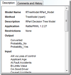
Note that when you select your PMML model you will see information about the model in the description pane. Not all PMML models support retrieving the probability of output states like the models created using Predixion Insight. If a PMML model supports this functionality it will be listed in the Output section in the Description pane. Retrieving the probability of the output states is required to use Profit Charts and Accuracy charts on PMML models.
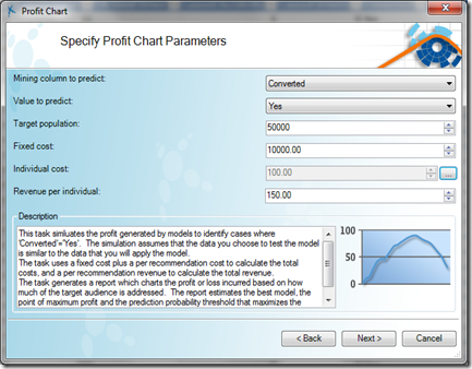
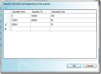
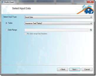
Clicking Next on the dialog will bring you to the Select Input Data page. The R Demo Excel file has some prepared test data that you can use. You can also use data from PowerPivot, or test data that is automatically separated in Predixion datasets. If you were already looking at the test data when you launched the wizard, the table would already be selected – otherwise select the test data and click next to advance.
On the final page of the wizard, you need to specify the relationships between the model columns and the columns in your Excel spreadsheet. Predixion Insight will automatically bind the columns based on the column names if possible. At this point you can click the Finish button and be done with it, however, if you want to be able to easily rerun the profit chart with different parameters or even automate the process, you can click on the little arrow on the Finish button and select “Execute and Create a Visual Macro.” This will not only start the Profit Chart, but also create a worksheet with a Profit Chart Visual Macro – that is, a worksheet with the executable description of the job you just performed. This Visual Macro can be altered and re-run however you choose, and even executed from VBA or automated via SQL Server Integration Services

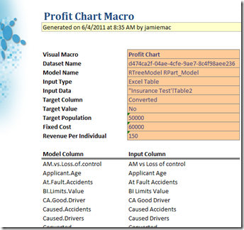
When the progress dialog comes up – it’s a good idea to dismiss it by clicking on the “Minimize to Task Pane” button which allows the operation to execute in the background. When complete you can click on the “Results” button in the job chicklet which renders the Profit Chart into your workbook. You can also click on the collaboration icon to send the job results directly to your friends and colleagues or publish to shared collections.
The actual Profit Chart itself shows us the maximum profit we can expect by using the R model to optimize our campaign. Additionally it tells us the probability threshold we need to consider when selecting which leads to contact. Specifically, in this case, we should only contact leads that have a probability of conversion, as dictated by the model, of 34.4% or greater.
Now that you know how to evaluate your R model – or more appropriately – how to evaluate the predictions from your R model, it’s time for the climax of this series – applying that R model to PowerPivot data. Actually, it’s almost an anticlimax because it’s so simple, but let’s walk through the process and I’ll point out some interesting bits along the way. To get started, click on the Query button on the Insight Analytics ribbon.
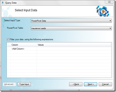
As before you select the model you want to query (the R model!) and then select the input data. This time, you need to select that the Input Type is “Power Pivot Data.” If you haven’t already, Predixion Insight will launch PowerPivot and then connect to PowerPivot to collect the list of tables. One option you have with PowerPivot data that you don’t have with Excel data is that you can specify an arbitrary data filter. This allows you to, for instance, only score the leads that were received within the last month or so rather than the entire dataset – very handy for continual deployment of your models!
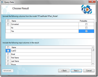
After selecting your data, you have to map the model columns to the data columns as you did with the Profit Chart and then you get to the results page. In the results page you choose what information you need from the model. Since we are looking for leads with a probability to convert of at least 34.4%, all we need to do is to check the Probability of Yes checkbox. Since we want to integrate the results directly into PowerPivot, we don’t need to check any of the boxes to copy source data. You generally use that option when you need to move the results to a different destination.
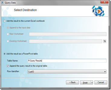
Finally, you tell Predixion Insight what to do with the result. In this case we are going to add the results from our R model back into PowerPivot. Specify a table name and check the box with appends the result to the original table. Predixion Insight automatically detects the best identifier column, so you don’t have to actually specify anything there.
Again, you can finish (even choose to create a Visual Macro) and either wait for the job complete or dismiss it and keep working while the job executes in the background. Once the job finishes it will automatically update PowerPivot, or if you dismissed it, you click on the results to populate the PowerPivot table. Like the ProfitChart result, you can share the results with colleagues by clicking on the collaboration button – in which case, it would probably be a good idea to add some of the additional source columns for context! Note that you can also change the name of the job chicklet by selecting and typing over the default name. This can be useful when sharing or if you want to revisit past job submissions.

Finally after you’ve fetched results you can see the results in your PowerPivot table. In this screenshot you see that Predixion Insight created a new PowerPivot table called “R Query Results” and added a new calculated column to the source table that references the predicted result for each row.
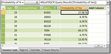
Now you can analyze your PowerPivot data the typical way (PivotTables published to SharePoint!) integrating predictive results from R. My first step would be to add a calculated column indicating which leads crossed the threshold indicated by the ProfitChart, but the possibilities are limitless!




Hi! Great series of posts. Thank you. I am just trying to understand in what cases would this type of R integration would be beneficial vs. using Predixion as a standalone prediction software within excel.
ReplyDeleteAlso what is your opinion in terms of performace of these tecniques when used with large datasets? Thanks! and I have subscribed to your RSS feed so keep up the good work.
Great ppost
ReplyDelete